Bush’s grand achievement on the domestic side was the most recent turn of a triple play of tax cuts — John F. Kennedy’s, Ronald Reagan’s and his own — all of which prove the incredible economic wisdom of allowing people to keep more of the money they make [emphasis added]. It is unfortunately a lesson that is as quickly unlearned as it is productive when relearned. We are watching its unlearning now.
... then I says, "Let's talk about it, shall we?"

You were saying?
11 comments:
SCARY
http://www.nytimes.com/2009/01/08/us/08labor.html?_r=2
You should really talk about this...
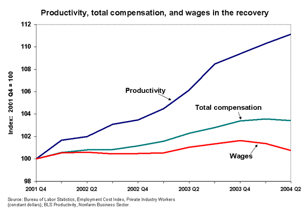
Add in a line for inflation, and it looks even worse.
That, or index them to the CPI - either way, it's fugly.
What are you guys talking about?
Productivity is way up!
Another little fun fact: the divergence in indexed wages and total compensation isn't because workers gained new benefits during that time. Rather, it reflects the rising cost of health care plans during that time frame.
Questions I have about this graph:
How does one measure "productivity"? What are those units? Follow up question: How are those normalized to dollar dollar bills?
I guess I could look them up myself, but I am busy being productive at work.
Jason
The lines in the graph are "indexed" to each other at a certain point in time (in 2000 in the first graph and 1973 in the latter). Basically, what this does is that it takes the ratio at the point where the graph is indexed and graphs how that ratio has changed. For example (using the first graph), let's say that productivity is measure in "widgets produced per hour" (the metric itself being relatively unimportant) and wages in "dollars per hour". If at t=0 that ratio is 8 widgets:$5/hr, that would be indexed as 100. So, if wages and productivity increased together, we'd see that line track together (if at t=2, productivity was 16 widgets, wages would be $10/hr). In other words, the graph charts the changes in productivity against changes in compensation.
That said, I think that "productivity" is measured by the GDP (or GNP - I forget which).
Oh, and the y axis unit is "% change in..." So that first graph would show that from 2000 to 2004, productivity increased by 11%, while wages increased 1% before declining and total compensation only increased by 3%.
this is some great wonk, wobs.
Agreed. Thanks for the schoolin'
Jason
Post a Comment